Spectacular Spider-Man’s Hidden Tribute to Marvel’s Classic Coca-Cola Posters
Marcos Martin’s splash-page artwork for Spectacular Spider-Man recalls the bold character-poster designs Marvel created for Coca-Cola in the 1980s, giving a modern story a distinctly nostalgic visual flavor.
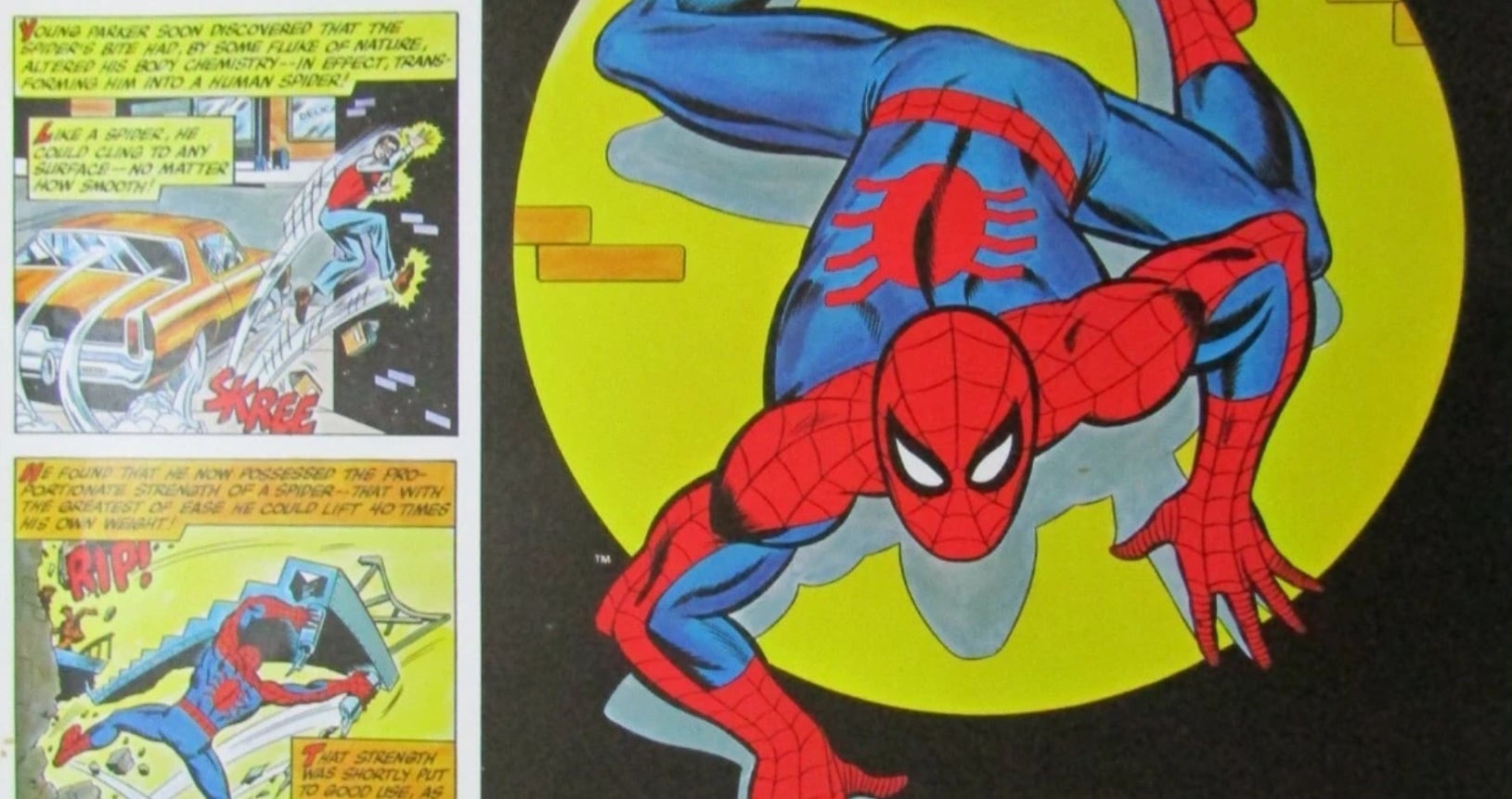
Some comic-book homages are announced with a reference, a caption or a familiar character returning to the page. Others are hidden in the way an image is composed. In Spectacular Spider-Man, artist Marcos Martin appears to have used the second approach, shaping several splash pages around the visual language of Marvel’s character posters produced for Coca-Cola during the 1980s.
The connection helps explain why Martin’s pages can feel immediately familiar even when a reader cannot identify the reason. Their energy, arrangement and presentation recall a period when Marvel characters were often treated not only as comic-book figures, but also as colorful pieces of pop-culture advertising. The result is artwork that belongs to a contemporary Spider-Man story while quietly looking back to a very specific era of Marvel design.
The homage is especially notable because it does not depend on reproducing one poster exactly. Instead, the pages evoke the larger idea behind those posters: a single hero presented with dramatic confidence, a strong silhouette, a striking pose and an image built to make the character instantly recognizable. Martin’s work brings that poster sensibility into the sequential world of comics, where a full-page image can pause the action and give Spider-Man the kind of grand introduction usually associated with promotional art.
Advertisement



That approach is a natural fit for Spider-Man. The character’s appeal has always depended partly on movement and immediate visual recognition. His mask, web pattern, red-and-blue costume and acrobatic body language allow an artist to communicate his identity at a glance. A poster-style splash page can emphasize those qualities by simplifying the visual message and concentrating attention on the hero.
In a conventional comics sequence, panels divide an action into stages. A reader sees a character prepare to leap, make the leap and land. A splash page can instead present the moment at its most memorable, allowing the pose, composition and surrounding details to do the storytelling. Martin’s pages use that opportunity in a way that recalls advertising illustration without losing the sense of motion associated with Spider-Man.
The 1980s Coca-Cola posters provide an important part of that visual vocabulary. Their appeal came from combining a familiar Marvel character with a highly accessible commercial format. The characters were recognizable immediately, while the poster treatment gave each one a polished, celebratory presence. The imagery was designed to be looked at as an individual picture, not simply read as part of a longer narrative.
Advertisement

:max_bytes(150000):strip_icc()/marvel-wolverine-video-game-091826-9c0fced69e42415196a9ee81b37032bc.jpg)

That distinction matters when considering the tribute in Spectacular Spider-Man. Martin is not merely borrowing an old-fashioned color scheme or adding a retro detail to the background. The homage operates at the level of presentation. The page becomes an event in itself, much as a character poster could function as a standalone image outside the story that inspired it.
For readers who remember Marvel’s Coca-Cola campaign, the effect can be almost instinctive. The pages may seem familiar before the reference becomes clear. The same broad impression is present: a beloved superhero made larger than life, positioned for maximum impact and framed in a way that encourages the eye to take in the complete design. Even readers who have never seen the original posters can recognize the confidence of the format.
This is one reason visual references can be so effective in comics. A creator does not need to reproduce every element of an earlier image to recall it. A particular structure can be enough. The scale of a splash page, the emphasis on a single figure and the sense that the character has been placed before the reader like a collectible image can all work together as a form of memory.
Advertisement



Martin’s contribution is therefore more than a nostalgic wink. It demonstrates how older commercial artwork can become part of a modern comic’s storytelling language. The source of the inspiration may have been advertising, but the new pages use that inspiration to shape the reader’s experience of the story. A splash page can introduce an emotional beat, heighten a revelation or simply allow Spider-Man’s personality to fill the page.
That personality is essential. Spider-Man is not usually portrayed as a static emblem. He is defined by speed, improvisation and a mixture of confidence and vulnerability. A successful poster-like image has to preserve those qualities rather than reduce him to a logo. The tribute works because the design language is being applied to a character who is already visually expressive.
The idea also fits the broader relationship between Marvel comics and popular culture. Marvel heroes have long appeared beyond the boundaries of the monthly comic, including in advertising, merchandise, posters and other forms of licensed art. Those appearances can sometimes be treated as separate from the main stories, but they also influence how audiences understand the characters. A reader may encounter Spider-Man as a comic-book hero, a screen character, a toy, a shirt design or a poster image, with each format emphasizing a different part of his identity.
Advertisement



The Coca-Cola posters belong to that larger history of Marvel’s characters moving between media and visual formats. Their importance in this case is not simply that they are old promotional pieces. They represent a recognizable moment when superhero art could be bright, direct and proudly commercial without losing its connection to comic-book illustration. Martin’s pages revisit that balance from a modern perspective.
The homage may also make the images feel unusually tactile. Poster art traditionally invites the viewer to imagine the picture displayed on a wall, where it can be appreciated from a distance. A splash page has a similar physical presence within a comic. When a reader turns the page and encounters a large image, the artwork briefly behaves like a poster before the narrative continues.
That pause can change the rhythm of a Spider-Man story. The character’s adventures are often associated with rapid movement and dense visual information, but a splash page asks the reader to stop. Details that might pass quickly in a smaller panel become part of the page’s overall design. The reader can absorb the pose, the expression, the costume and the surrounding space as elements of one composition.
Advertisement


It is also a reminder that a comic page has two identities. It is both a piece of storytelling and a designed object. The first function concerns what happens in the story. The second concerns how the page looks when viewed as a whole. A poster homage brings that second identity to the forefront, encouraging readers to appreciate the page not only as a moment in Spider-Man’s life, but also as an illustration constructed for impact.
For collectors and longtime Marvel fans, that double purpose can make the pages especially rewarding. Familiarity with the earlier Coca-Cola material adds another layer, but the reference does not exclude newcomers. The images remain readable as Spider-Man art even if the historical connection is missed. The tribute is hidden, not required, which allows the pages to operate on more than one level.
The choice to reference the 1980s is significant because that decade has a strong visual identity in popular culture. Bold colors, clear character silhouettes and direct promotional imagery are often associated with the period. Yet the pages do not need to become pastiche. By filtering those qualities through Martin’s own style and through the demands of a current comic, the work can acknowledge the past without pretending to be an artifact from it.
Advertisement


That is the difference between an homage and a replica. A replica asks the audience to compare two images for matching details. An homage asks the audience to recognize an influence while appreciating what the new artist does with it. In Spectacular Spider-Man, the older poster format becomes a foundation for new compositions rather than a template that limits them.
The connection is particularly well suited to a character as commercially visible as Spider-Man. Few superheroes have been represented in so many different visual styles, and his design has proved flexible enough to survive changes in era, format and audience. A reference to promotional art acknowledges that long history while keeping the focus on the character’s enduring graphic power.
There is also a playful quality to the tribute. The Coca-Cola association can make the images feel almost refreshing in the literal sense suggested by the original source material, but the deeper pleasure comes from spotting the idea beneath the surface. Readers may initially respond to the pages as exciting Spider-Man illustrations, then recognize that the presentation resembles something from Marvel’s past. The discovery turns a strong page into a conversation between different generations of superhero art.
Advertisement


That kind of discovery is valuable in a medium built on accumulated history. Comic books are filled with visual traditions that creators can quote, adapt and reinterpret. Sometimes those traditions come from earlier stories; sometimes they come from covers, advertisements or promotional campaigns. By drawing on the Coca-Cola posters, Martin demonstrates that a comic’s influences can come from the wider ecosystem surrounding the medium, not only from its narrative pages.
The result is a reminder that nostalgia works best when it serves the present. The reference does not exist merely to reassure readers that the past is being remembered. It gives the modern artwork a particular texture and helps define the way the pages should be seen. The old poster language adds scale, clarity and celebration to the contemporary Spider-Man image.
For general readers, the takeaway is simple: the familiar feeling of Martin’s splash pages is deliberate. Their impact comes partly from Spider-Man’s timeless design, but also from a carefully chosen visual echo of Marvel’s 1980s Coca-Cola posters. Once that connection is known, the pages can be read in a new way. They are not just pauses in the action; they are modern character portraits shaped by an earlier promotional tradition.
Advertisement

:max_bytes(150000):strip_icc()/best-zombie-movies-of-all-time-091826-5accf3a038ac4ecabf9cab6f317ce535.jpg)
That hidden homage gives Spectacular Spider-Man an extra layer of personality. It rewards fans who recognize the source while remaining accessible to anyone drawn to the boldness of the images. More importantly, it shows how a seemingly distant piece of Marvel history can still influence the look and feel of a new comic. In Martin’s hands, the poster becomes a splash page, the advertisement becomes storytelling and a familiar Spider-Man image gets one more chance to make a lasting impression.